3)
 This is interesting because it uses simple colour schemes which could be adopted and things are spread out clearly. This also gives a quote from the film and a very clear title but edited in a unique way and this could be implemented into the print brief.
 The use of the collage in this print brief is an interesting way of presenting it and although I may not use this on the front cover the idea of a collage could be used with the double-page spread.
4)
 This contents page uses a selective colour scheme with the page numbers larger than other pieces of text to grab the readers attention. Moreover the smoke drifting in the background could be a reoccurring theme within the print brief and happen on every page.
 This contents page is similar to the previous one however it uses more images from whatever it is advertising. Also the logo continues on each page of the booklet and this should definitely be used in the print brief.
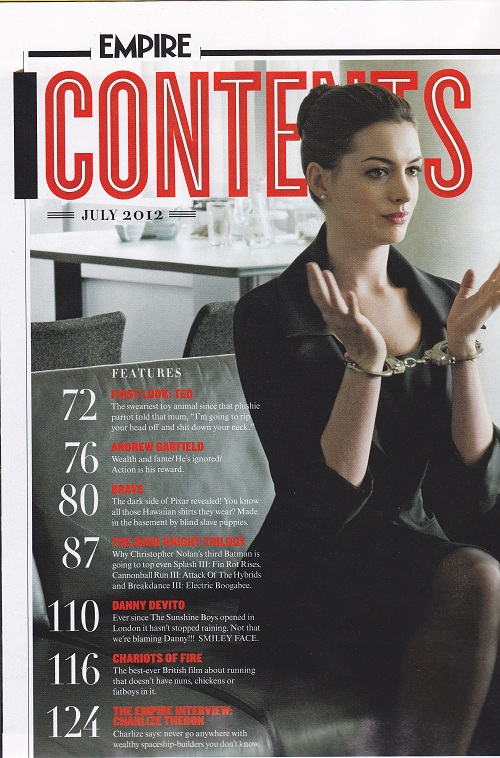 This contents page is from Empire again but this includes one central image including a well-known actress to entice the reader as well as the numbers being the larger than the other text.
 This contents page features some advertising of other magazines relating to the film. also the text is in its own space with enough room for the picture which doesnt cover up any of the numbers or the text.
planning/sketching
.People could be interested in the main character so he could be on the front cover
. Subtle things could stand out such as the hipflask to emphasise the problems faced by the main character
. small element of violence with syringe could appeal to younger end of the spectrum of the target audience
.news of human trafficking
all sketches completed on paper and double page spread ideas.
Booklets (re-do)

From looking at this programme i can see that it is very different from what a normal, mainstream magazine looks like. It doesn't include most of the 12 key conventions of a magazine cover, however it does include the language aspect of it being snappy and economical and it states exactly what the event is about
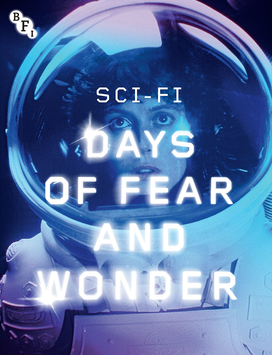
This film booklet is colourful and the dialogue fits the sci-fi genre well, the picture in the background of an astronaut looks as though she is fixed on something wonderful. Although it doesnt have a date on the front of it.
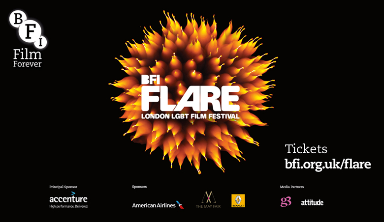
Another one from the BFI shows a simple colour scheme of black and a vibrant orange. This booklet also gives information about where to buy tickets from and the sponsors of the event as well as social media links and the name of the event.
No comments:
Post a Comment